August 12 - Weekly Progress Report #2
Happy Wednesday everybody! It feels like forever since the last report went up, even though it's only been a week... I hope that week has been good for all you folks reading this.
This time there are lots of assorted smaller things to talk about, so I'll try not to dwell on any one in particular for too long. If something really catches your interest, leave a comment about it and I can share more. Without further ado...
Items ahoy
There are a ton of new items scattered around the Caldera and in the shops of Terveiset Village. Keep your eyes peeled for skill and spell scrolls, quest items, and the many different weapons we've cooked up. Drawing all of these icons was kind of fun after getting into the swing of things, but god there's a lot of them... and more to come in further updates I'm sure. Oof.

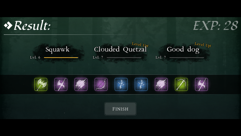
Finally, a Reward screen
Yes indeed, you can finally see the results of your efforts after combat. It has pretty animations and everything, though you'll have wait to see those when the next build goes out. Soon™
Status screen overhaul
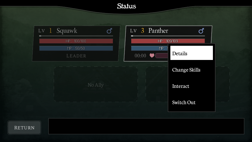
UI is probably my least favourite aspect of both design AND programming, so I don't usually get it right the first time. The old Status page was a manifestation of that. On the surface it looked "ok", but while the following might not mean much at face value, it was a big snag for me behind the scenes: the whole Status screen was coded in one monolithic file. Oh just an absolute nightmare. (Does Revenir run on Yanderedev-tier code?!)
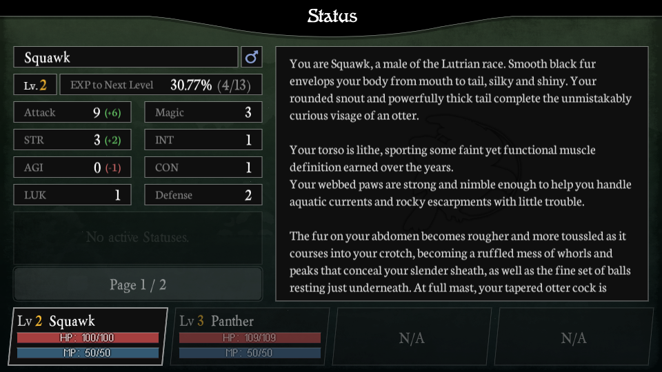
I went ahead and split things up into multiple menus to give the main view some breathing room. Everything has a fresh new design; the Details screen is especially new - albeit a little cluttered, but balancing information density with readability is beyond my pay grade :<
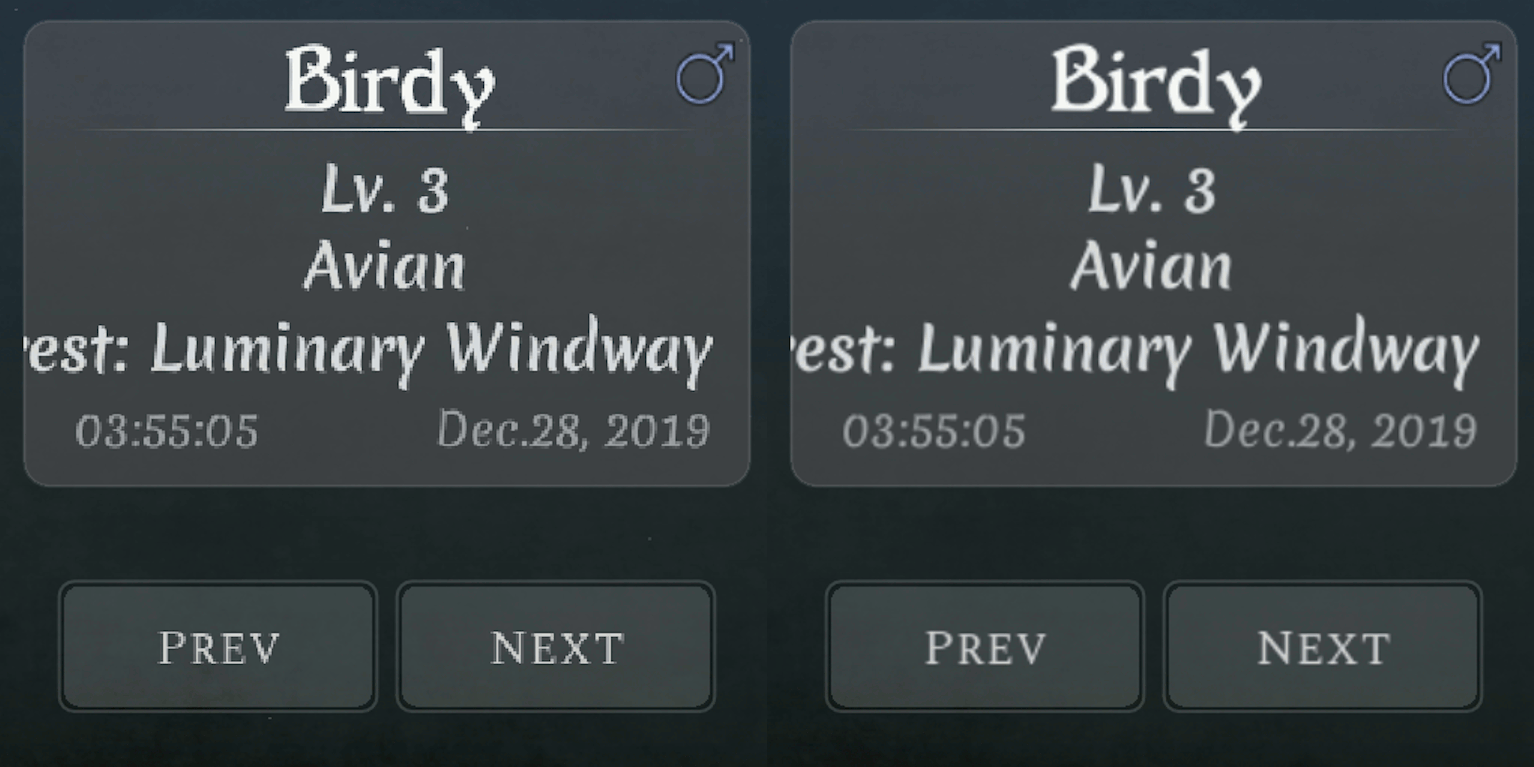
Please don't name everything "WWWWWWWWWWWWWWWW"
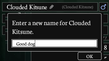
One of my favourite new additions made possible by this overhaul is the ability to name your allies! This is something I wanted to add for a long time as it's pretty simple, but working it out in the old UI would have been an atrocious experience. I expect to see some creativity from you guys with this one.
Old but still cool
Loooong ago I posted this comparison on my Twitter, sharing a lovely visual upgrade for those of you who like to play in higher resolutions. You might have noticed in the old public build that things get very pixelated and aliased when you play in fullscreen - this is no longer the case~
I'm deathly ashamed that the problem was caused by a single line of code, which set the texture filtering to "nearest neighbour" for every single asset, most noticeably fonts. It should have been "linear". I wanted "linear". Oof x2.
Die automatically, Mantis!
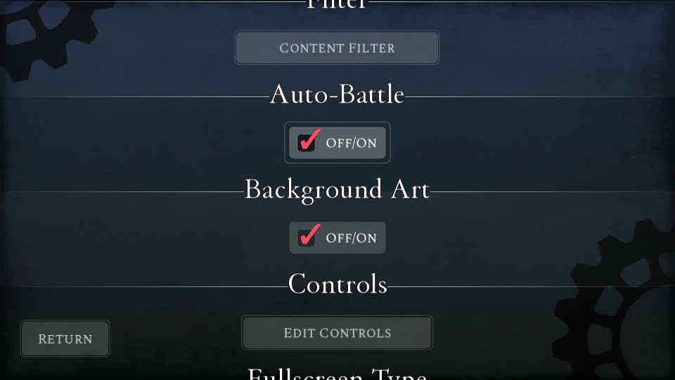
No, the Mantis Nymph isn't removed... yet. What I actually mean is that I added, by popular request, an "Auto-Battle" toggle to the Settings menu. I'm still ironing out the creases since the combat changes, but the idea is that an AI selects the """best""" option for you each turn and tries to win the fight while you sit back on your furry/feathery/scaly/whatever butt. It might even win a fight that you couldn't figure out! Definitely worth a try if you're the kind of person to sometimes have trouble with RPG battles.
Is that a potion in your pocket or...
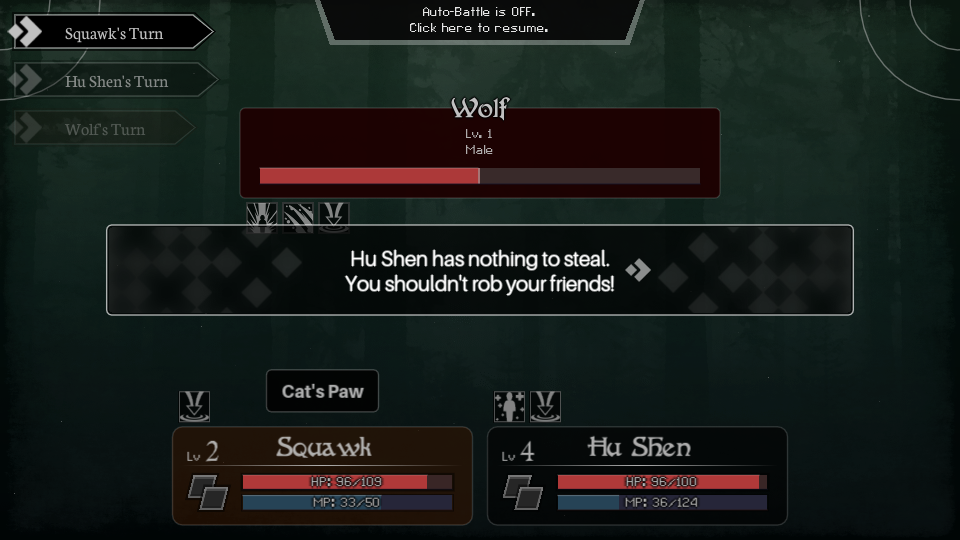
ITEM POUCH! I was saving this for next week, but I can include it here since it's a fun change. You can now use items in battle, which was mysteriously not something you were able to do for all this time! You can even use items on your enemies if they're distracted enough, so don't throw away that poisonous plant~

Shops are bigger and bolder
Somehow I never foresaw the need for a shop with more than 5 items, so previously the shop UI could only display...5 items. Of course now we have a merchant who sells THIRTY items, so it became clear some updates were in order. The new menu also shows off more information than before.

Performance Boooooost
A whole lot was done to boost the performance of the game, especially on mobile devices. There's not a whole lot of room for FPS gain, but I hope some of you out there can feel some subtle improvements come of it!
---
Alright alright, I'm not keen to talk your head off all day with any more random small changes.
As promised, the next Weekly Report will cover some of the story changes, new characters, NSFW content, and the combat rework. It's going to be a really fun one, and the most substantive for most players, so I hope you tune in when it arrives next week!
Until then, squawk!
Get Revenir
Revenir
An immersive NSFW text-based RPG with fantasy creatures.
| Status | In development |
| Author | Squawks |
| Genre | Adventure, Role Playing |
| Tags | Adult, Erotic, Fantasy, Furry, NSFW, Singleplayer, Text based |
| Languages | English |
| Accessibility | Configurable controls, One button |
More posts
- April 7 - Progress Report #17Apr 07, 2021
- Progress report next weekApr 01, 2021
- March 20 - Progress Report #16Mar 21, 2021
- March 3 - Progress Report #15Mar 04, 2021
- Poll: What species should the tavern owner be?Feb 24, 2021
- February 17 - Progress Report #14Feb 18, 2021
- February 5 - Weekly Progress Report #13Feb 05, 2021
- Resuming the dev logs later this week!Jan 31, 2021
- About the break!Dec 12, 2020
- October 21 - Weekly Progress Report #12Oct 22, 2020

Comments
Log in with itch.io to leave a comment.
excitd to see more
This game is going to be awesome. I hope you won't give up on it cause it'll be a huge hit for many rpg fans.
YESSSSSS, me and my allies WWWWWWWWWWWWWWWW, AAAAAAAAAAAAAAAA, and my favorite (dont tell the other two) ZZZZZZZZZZZZZZZZ are gonna kick so much enemy butt!
In all seriousness, you are doing an AMAZING job so far, keep up the good work! <3
Revenir is about to become one of the most well made rpg visual novels to date. I can feel it and I'm massively excited!